Project
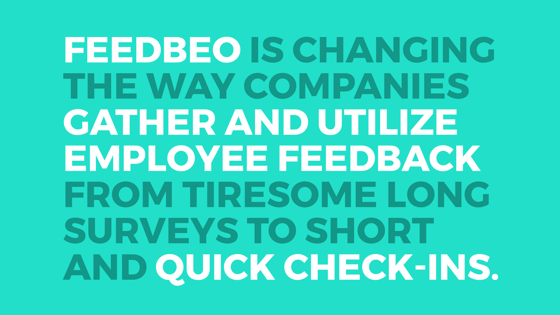
Feedbeo is a customer feedback gathering platform. For the past couple of years the company succeeded in building a service used by some of the biggest companies in Slovakia. Given this success, they decided to expand their product suite and offer additional functionality — team engagement and experience management tool. In the proccess they identified the need to revisit and refresh their identity and user interface of their products.
Work
As the main designer on the team, my role was to unify design system of the admin dashboard interface of Feedbeo, while integrating in this new functionality. I worked on wireframes and user flow that would simplify the navigation around the website, while still keeping the simplicity and cleanness of the original tool.
Together with the updated look I also revisited the identity aspect of the brand and created a new logo that went along with the refreshed website design.
Role
Brand identity
UI/UX design
Front-end developer
Logo explorations
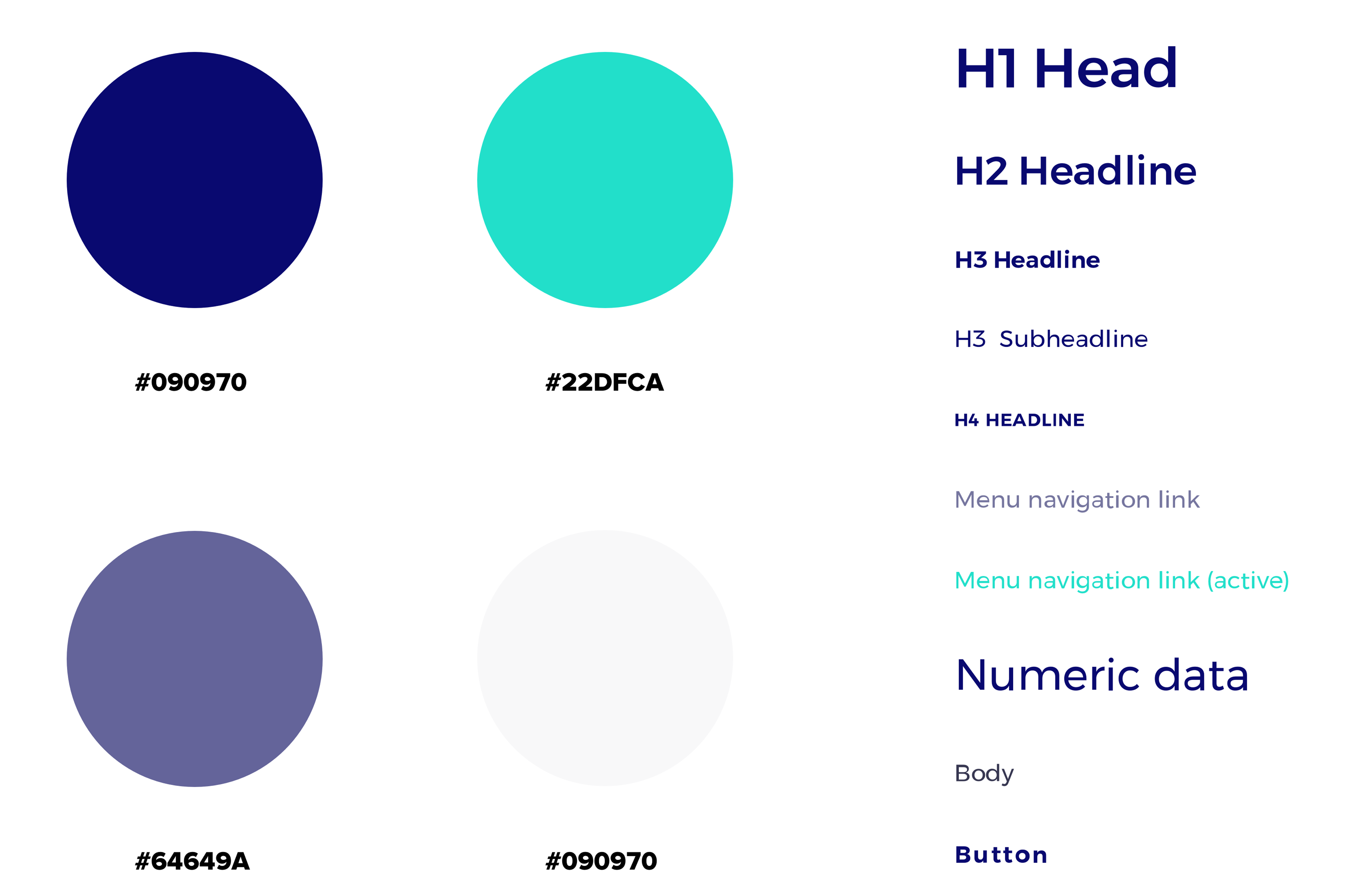
Colors & typography
Original admin dashboard interface lacked unified use of color and typography throughout the pages.
Identifying this issue, and to prevent it in the future, I created guidelines and coded CSS components used by the development team.
Dashboard redesign
The old dashboard interface had multiple issues that needed to be solved before addressing the new features:
- Generic Bootstrap template look
- Inconsistent design between pages
- Convoluted navigation
- Hard to scan list of feedbacks
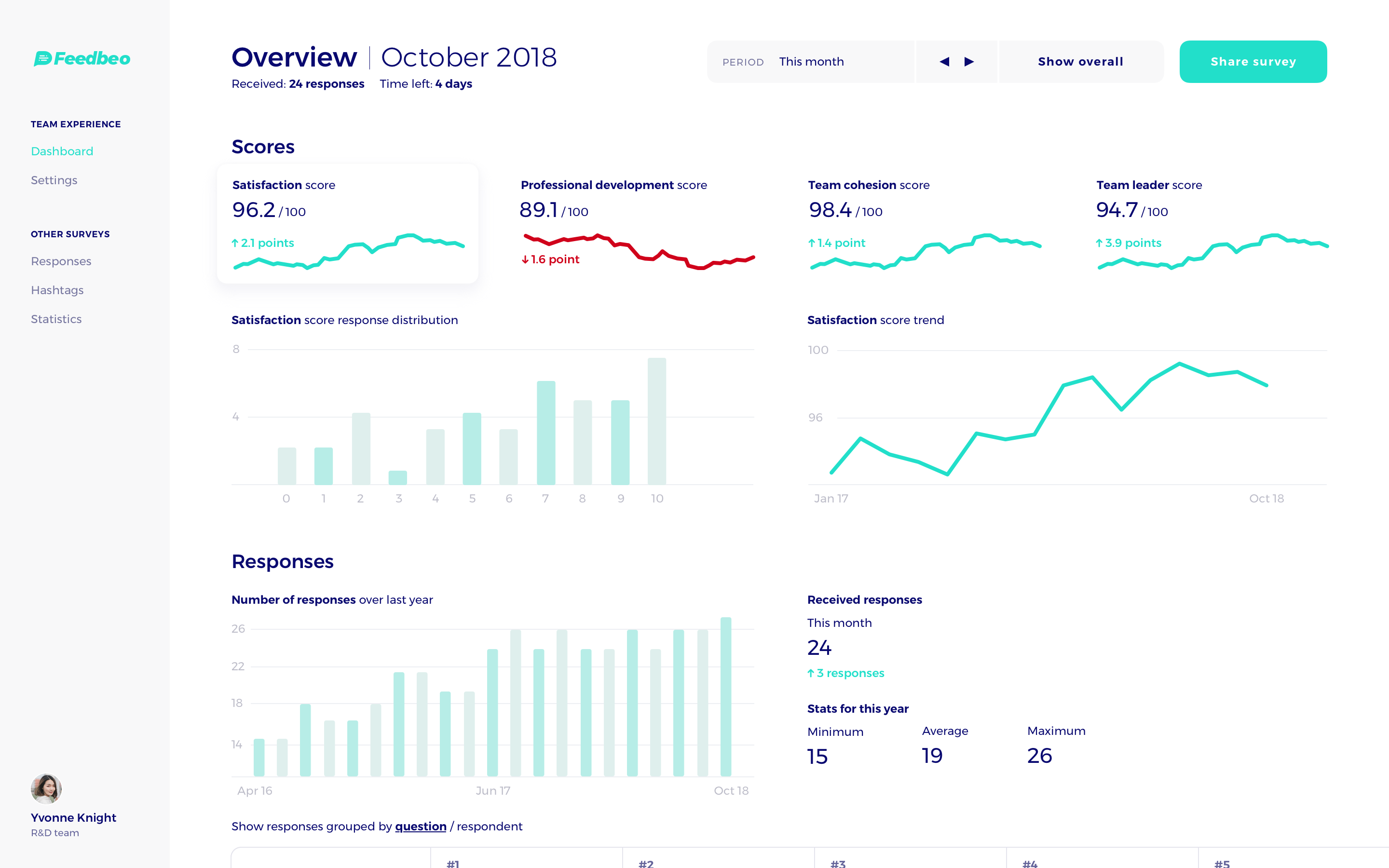
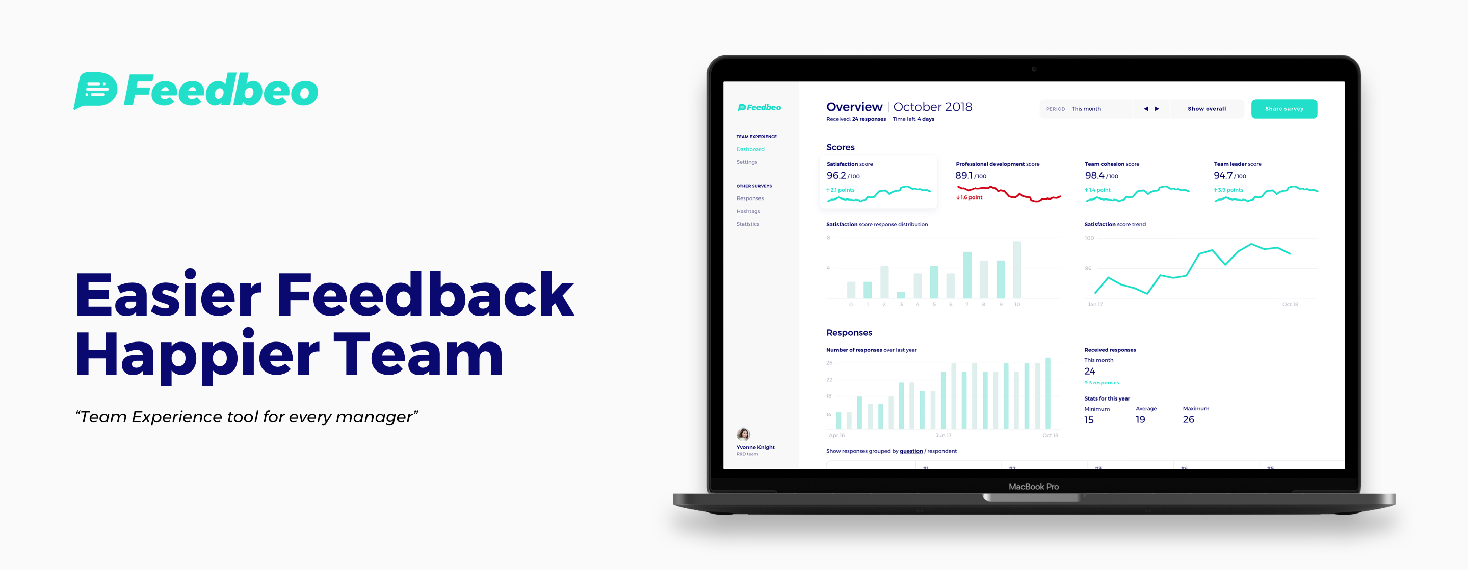
Team Experience | Manager Dashboard
Main goal while designing the dashboard was to accommodate two use cases:
- Quick check-in on how is my team's engagement and satisfaction
- Ability to identify possible problems by drilling down into the data
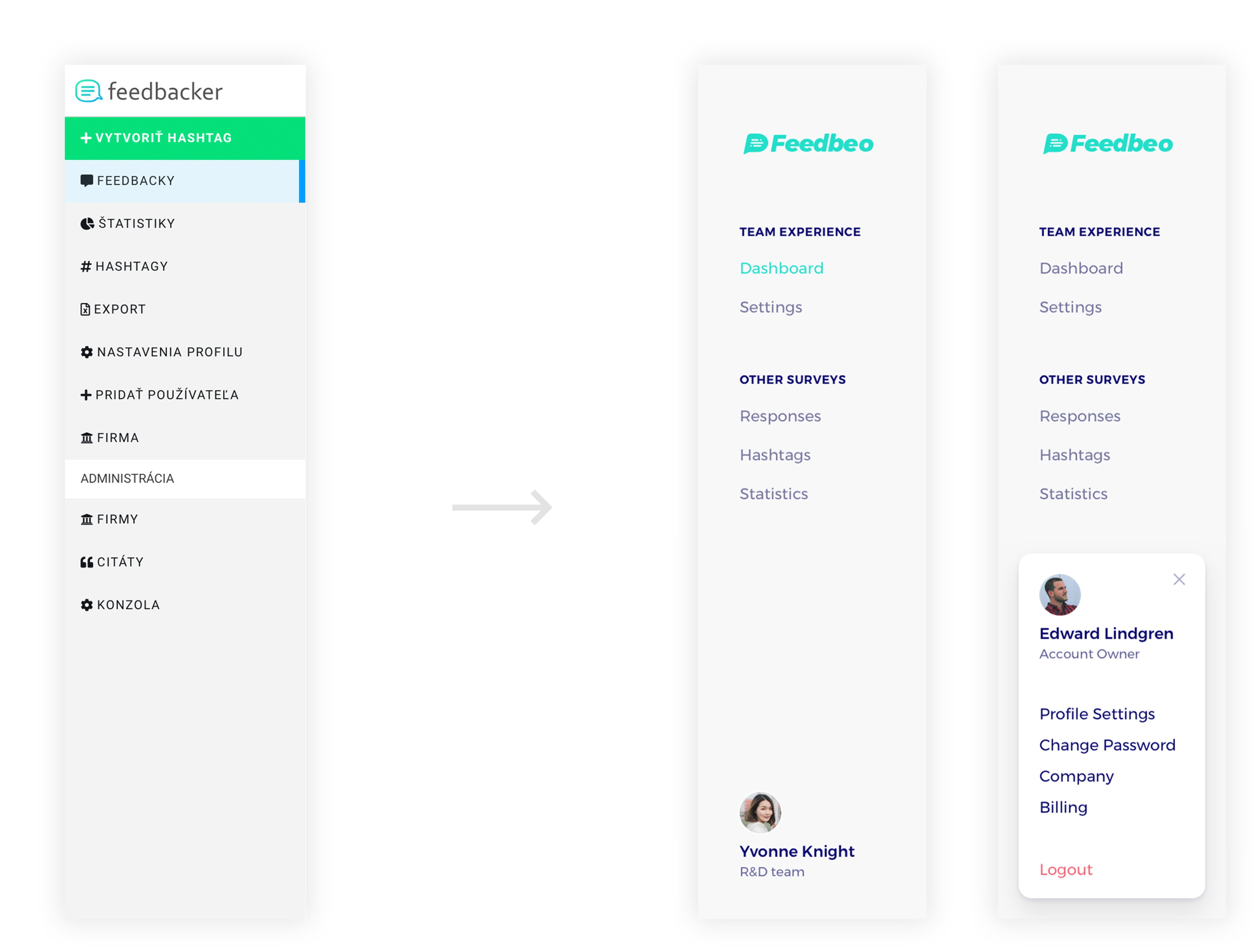
Side menu navigation
Old side menu had couple of serious design flaws:
- It mixed action buttons with page links without any signifiers as to which is which
- Pages weren't separated into sections
Redesigned navigation solutions and improvements:
- It moves action buttons (new survey and invite team member) to their respective pages.
- It separates page links into two sections, highlighting the new Team Experience functionality.
- It introduces openable, user profile containing additional role specific page links.
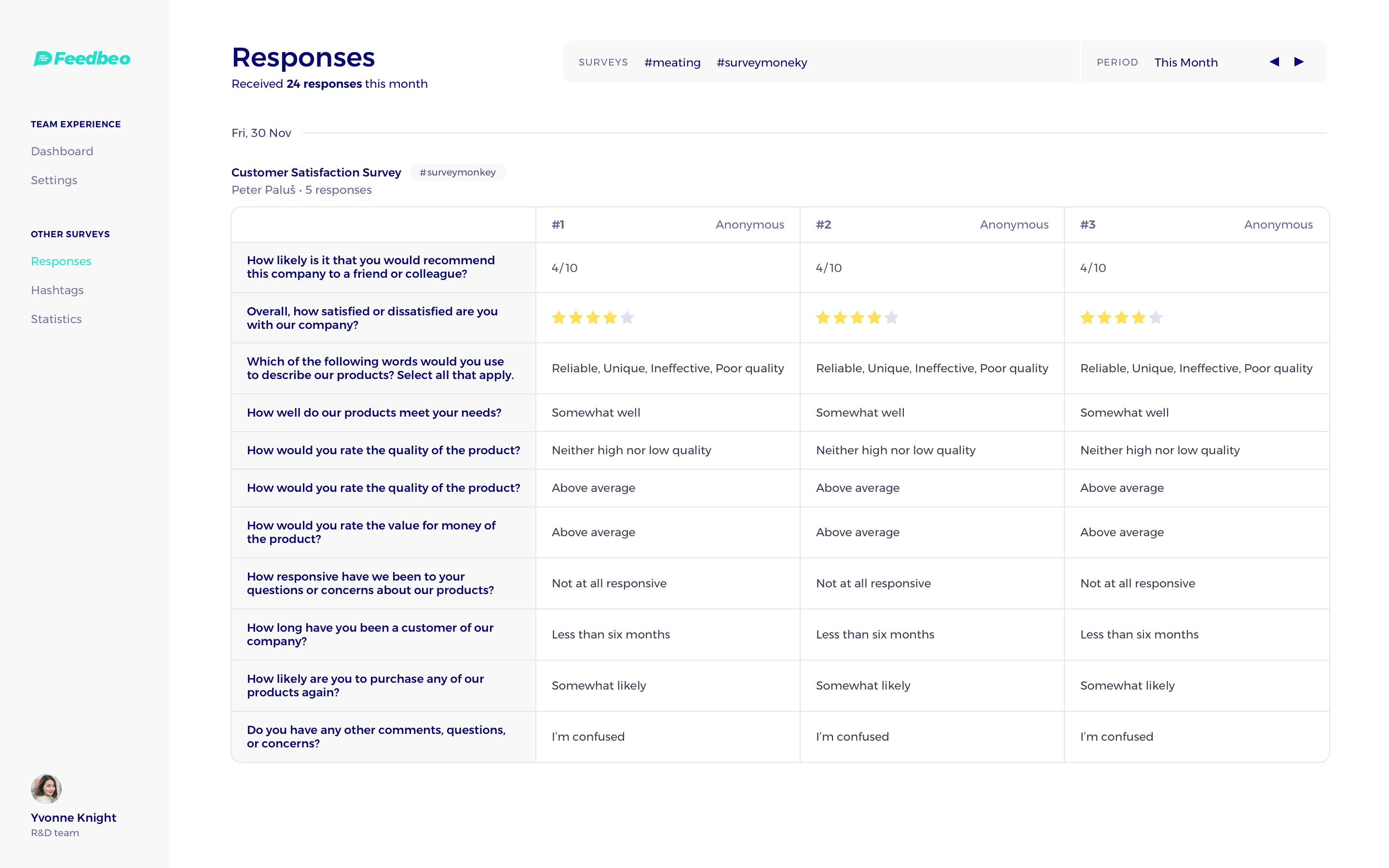
Updated feedback list
Previous feedback list had three core issues:
- Low information density
- Feedbacks were not skimmable, nor easily comparable
I addressed these problems by grouping and displaying feedbacks for a given survey next to each in a scrollable row.
Company, Team & Inviting teammates
One of the changes brought by the new Team Experience functionality was introduction of roles and role hierarchy within the company.
- Account owner — Manages entire company, can browse data for all the teams
- Manager — Manages and sees data for their own team
- Team member — Can see their own responses and anonymized team statistics
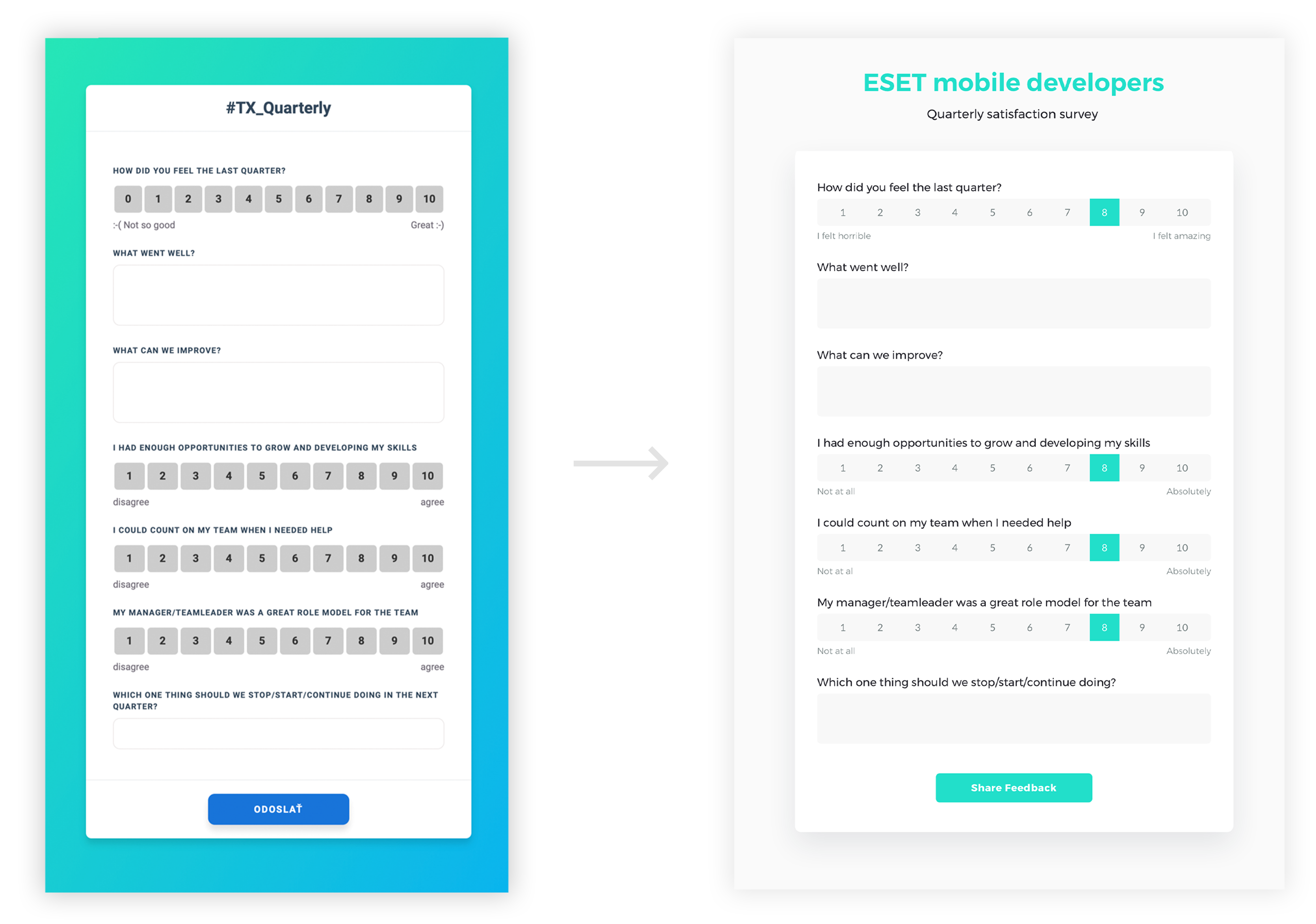
Survey redesign
Original survey form was placed on a distracting gradient background and used all-caps for the texts of the questions making longer quesions less legible.
Sign up flow
Users are able to sign up and create their account in just three screens.