Project
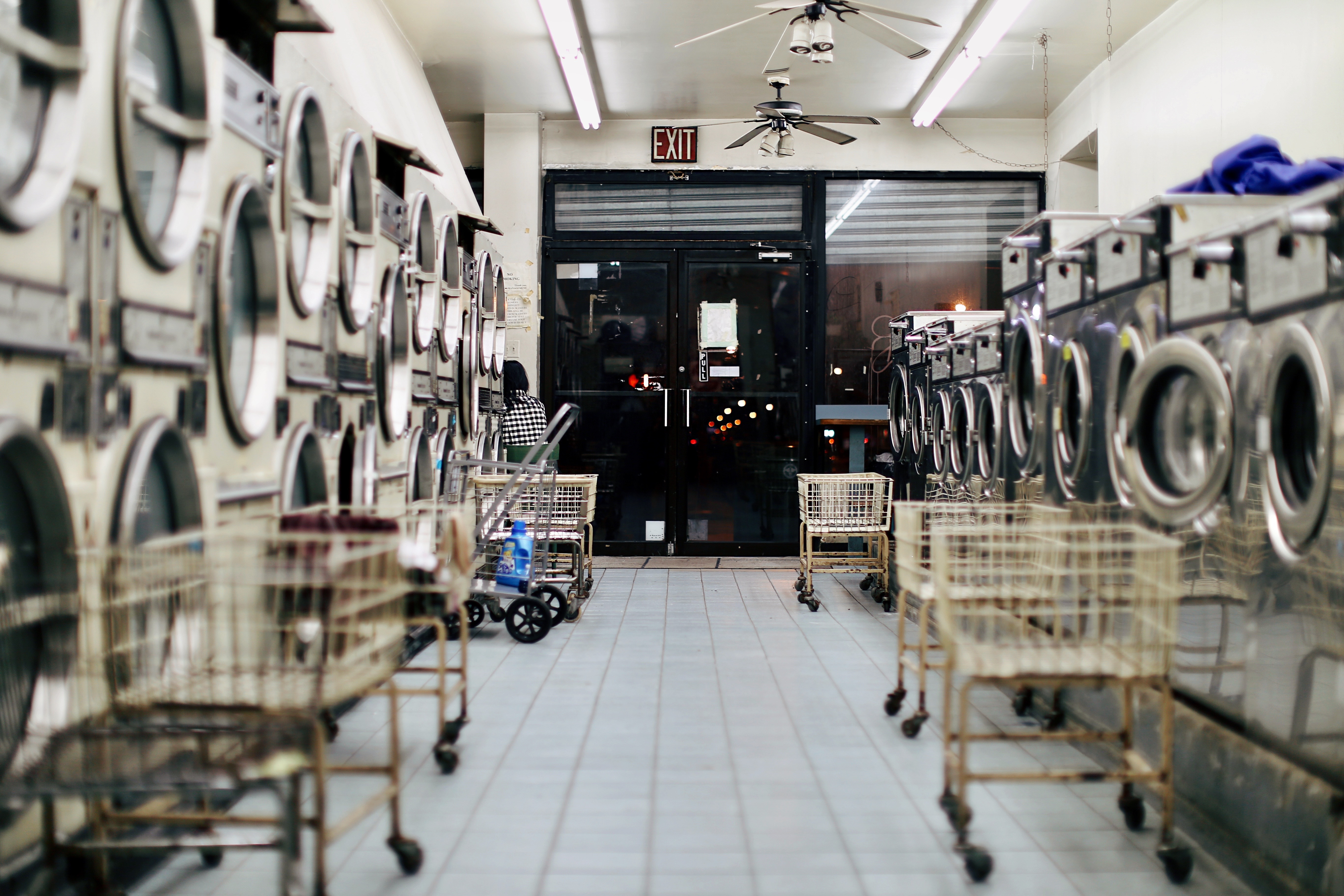
Stanley’s is a small, family operated laundromat located in North Beach, San Francisco. Serving the neighborhood for years it is well known by the locals but the increasing competition in the area created a need for a more attractive storefront. Based on the shifting demographics of North Beach, the main goal of this re-brand project was to update the store identity so it appealed to younger population in the neighborhood. The strategy was to create a modern visual system that would help differentiate the laundromat from the competition.
Work
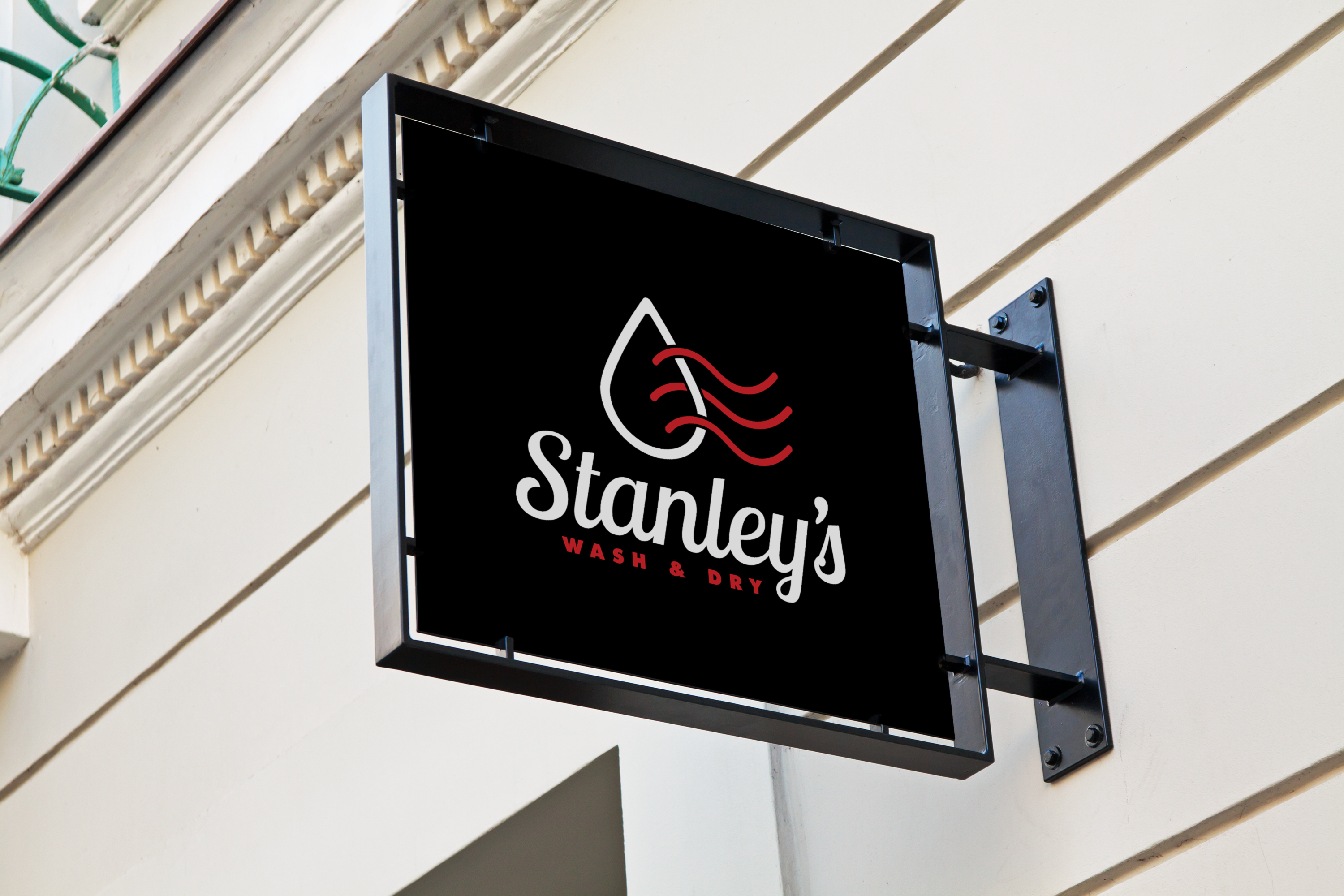
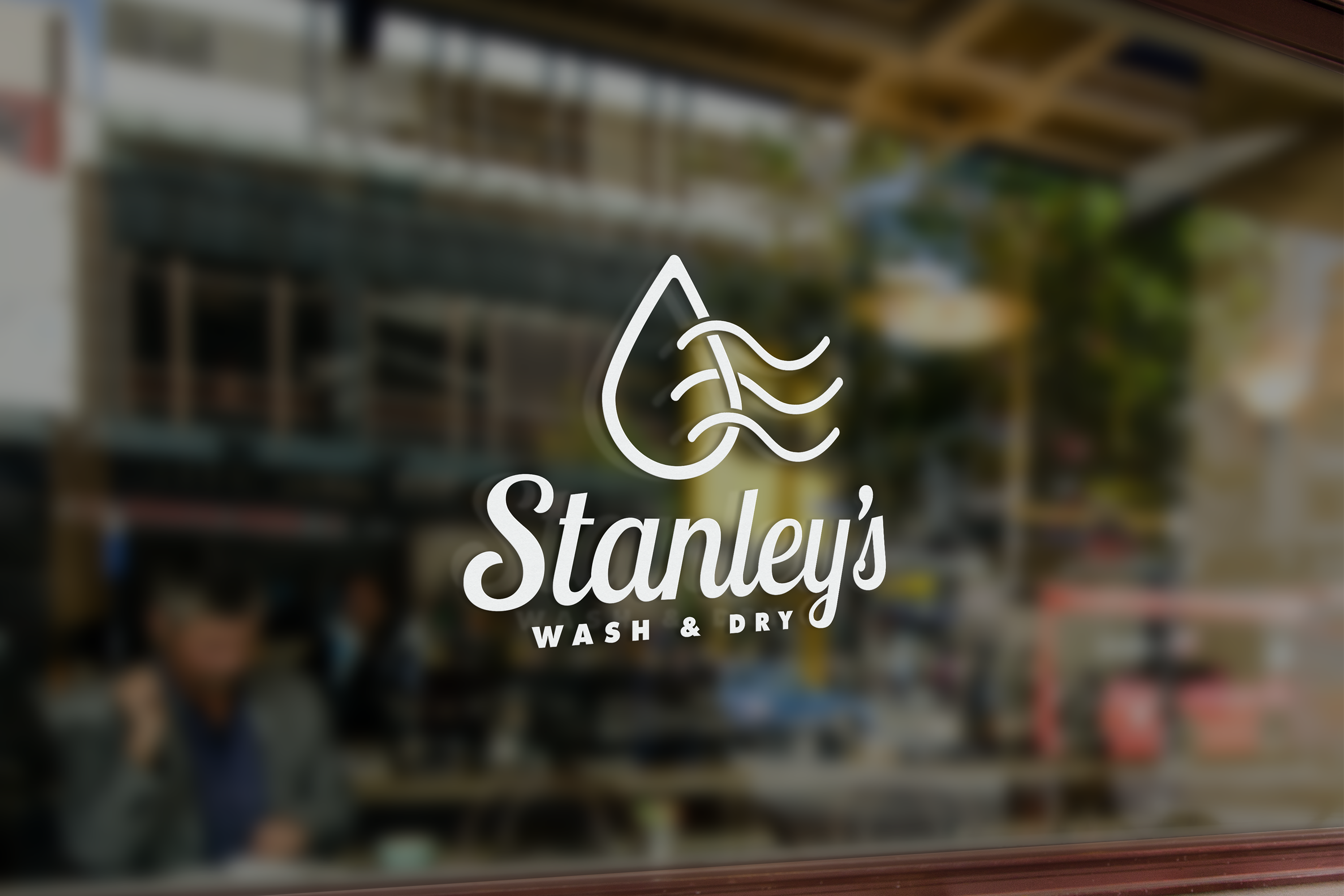
In this project I focused mainly on identity design and its application to all branding deliverables. In the ideation phase I researched the storefronts of other laundromats in the area. In conclusion, all of their logos consisted only of simple word marks and dull color palettes. Here, I saw an opportunity to differentiate Stanley’s by creating a symbol representing the store. In the process, my main inspiration were rows of washing machines which through iterations narrowed down to a simple wash and dry symbol, supporting the tagline in the company name.
Role
Brand identity
Process
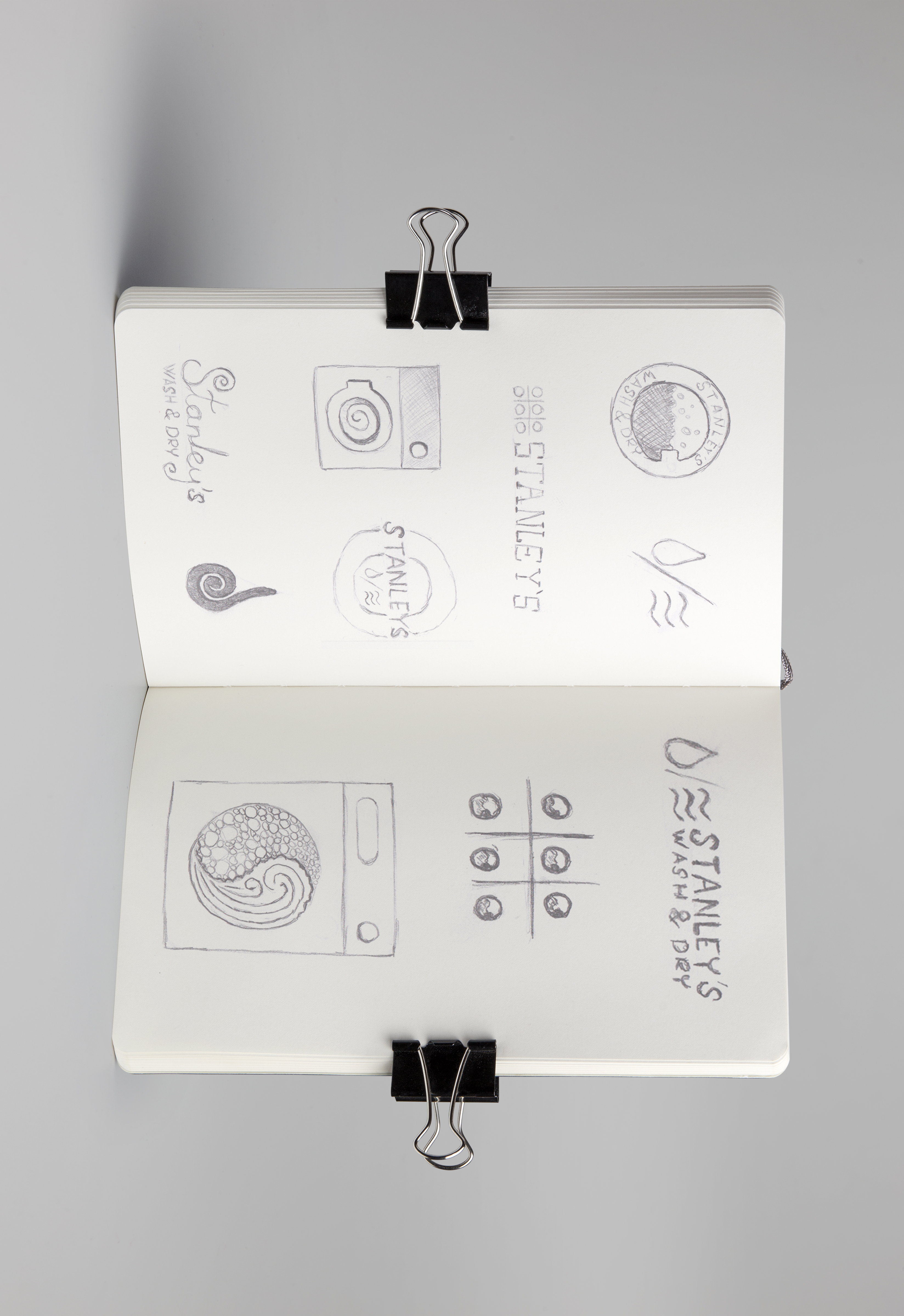
Final Logo Variants


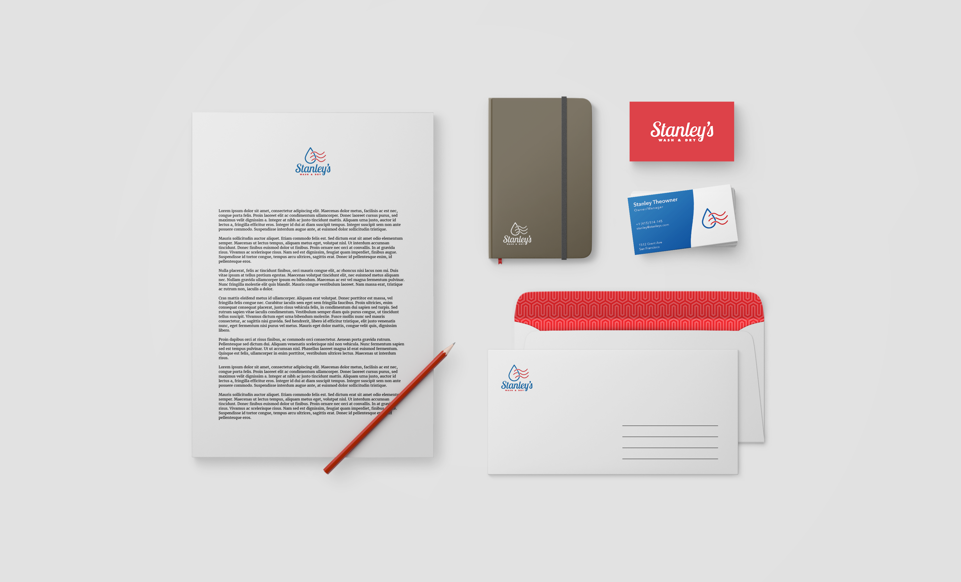
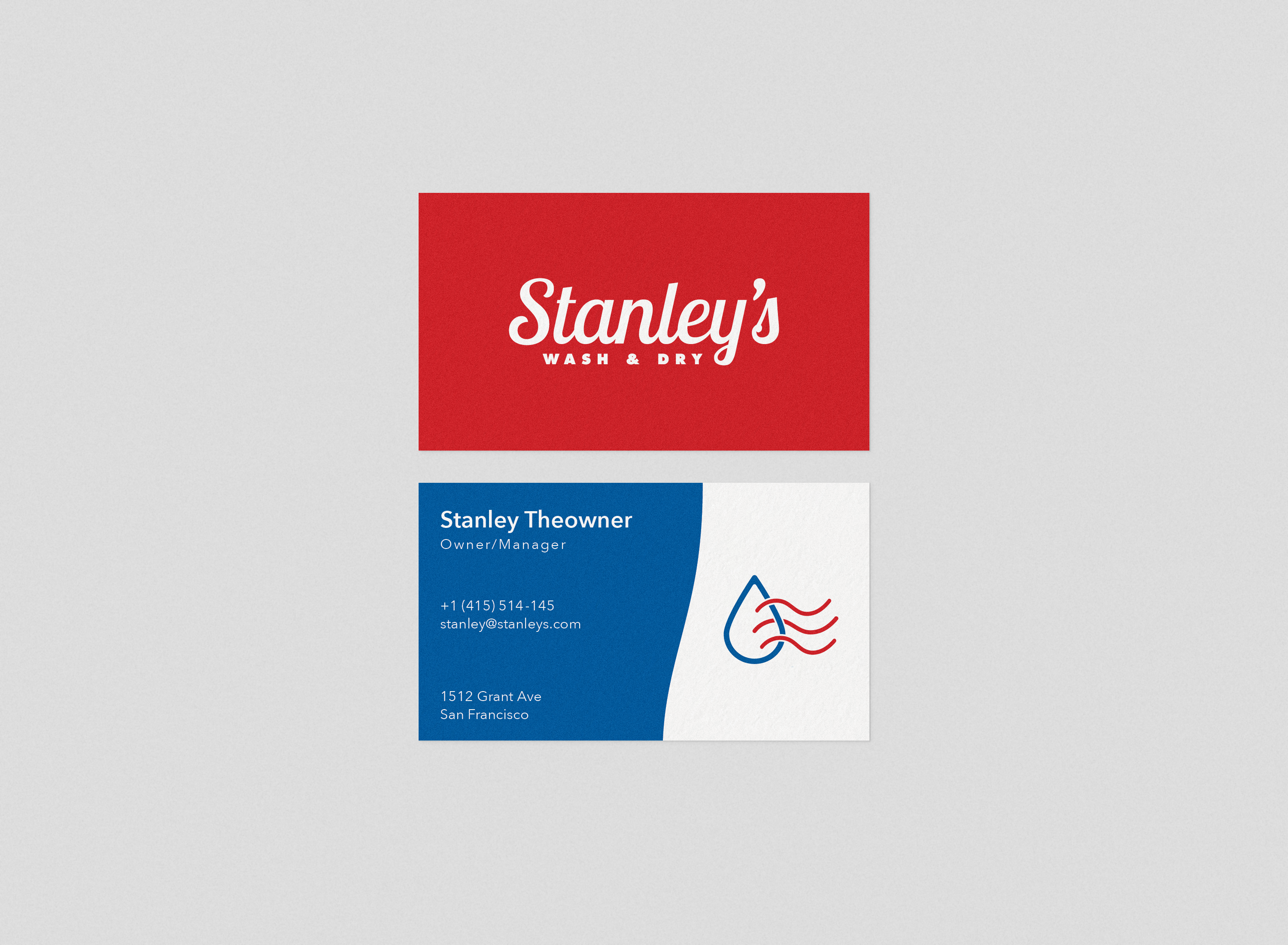
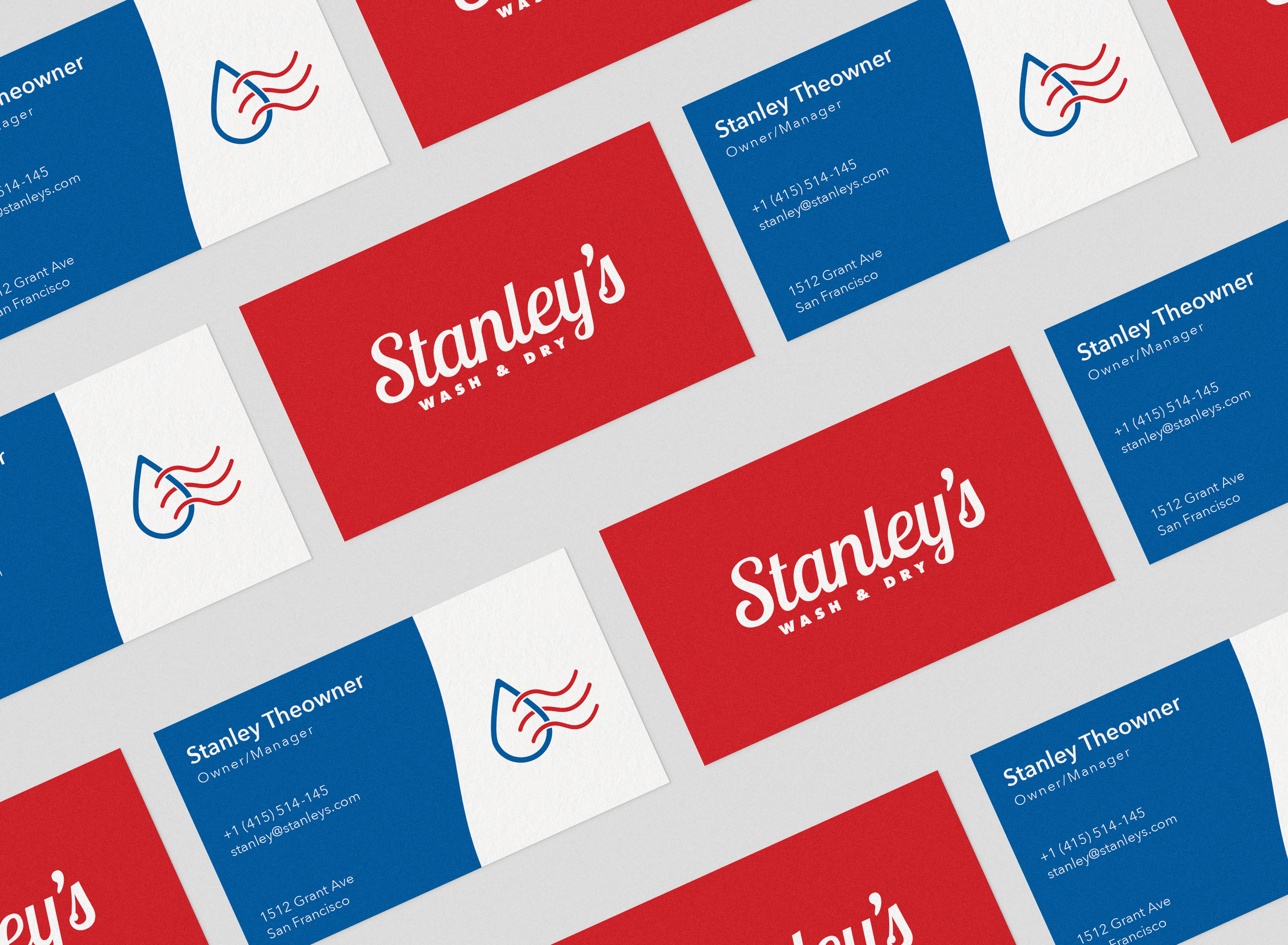
Logo Applications